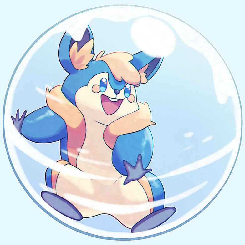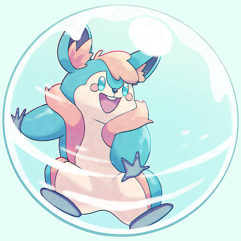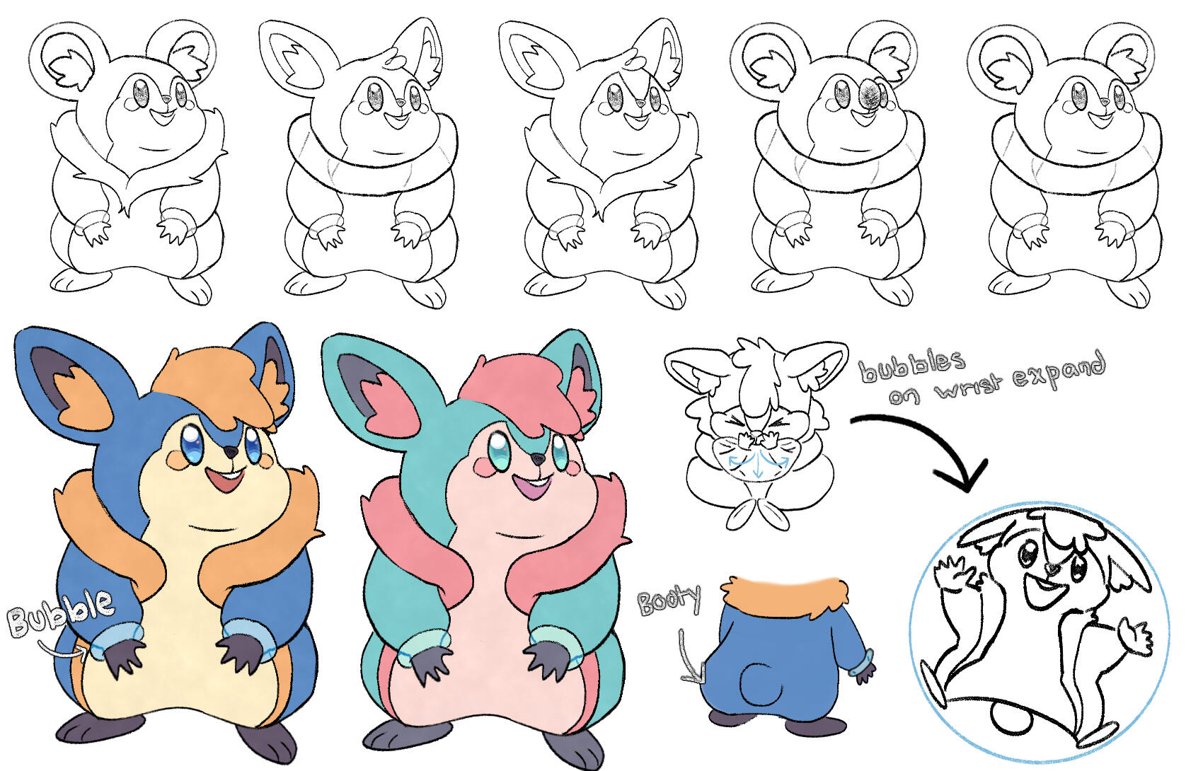
Qhimera's Gallery
Characters
Games
Piece of Heaven
Description of Work
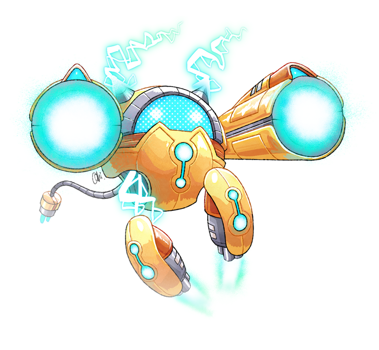
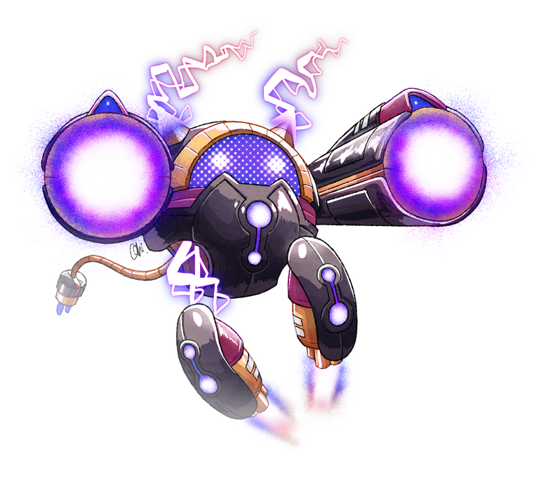
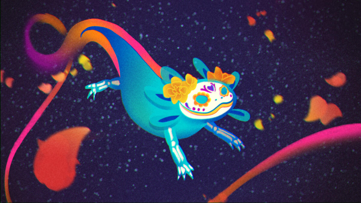
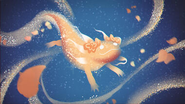
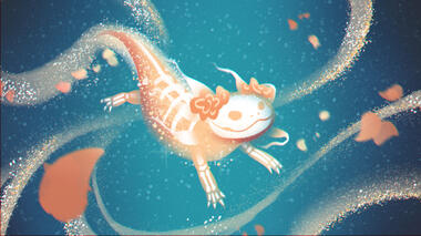
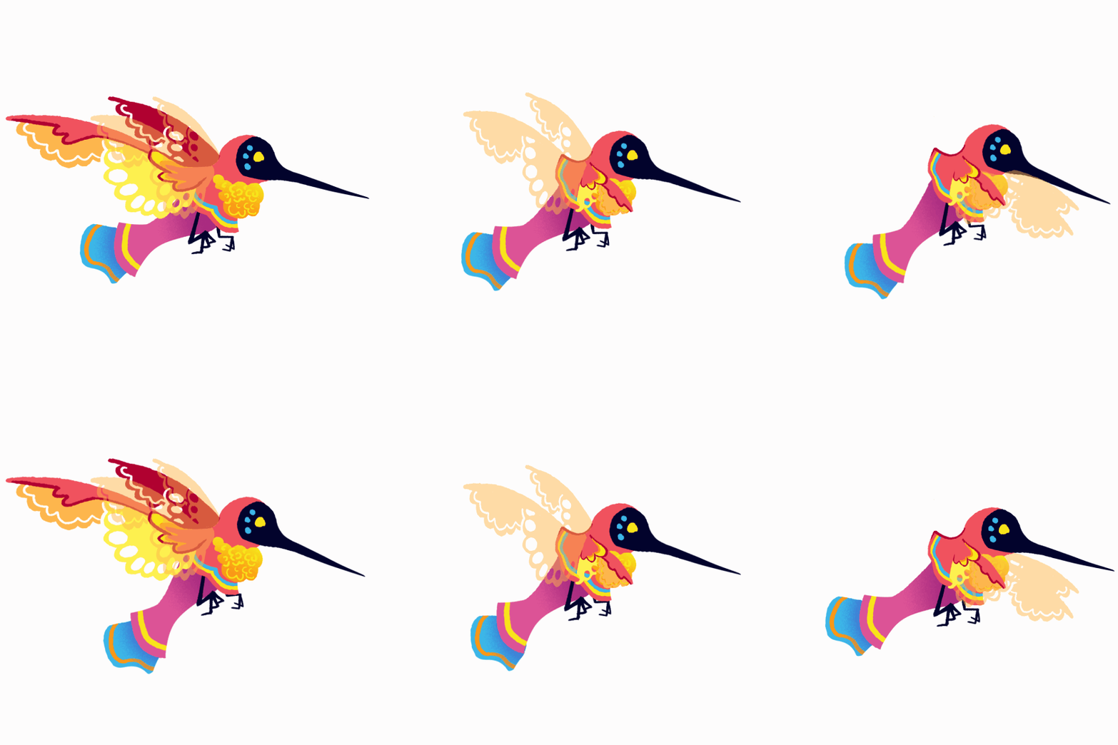
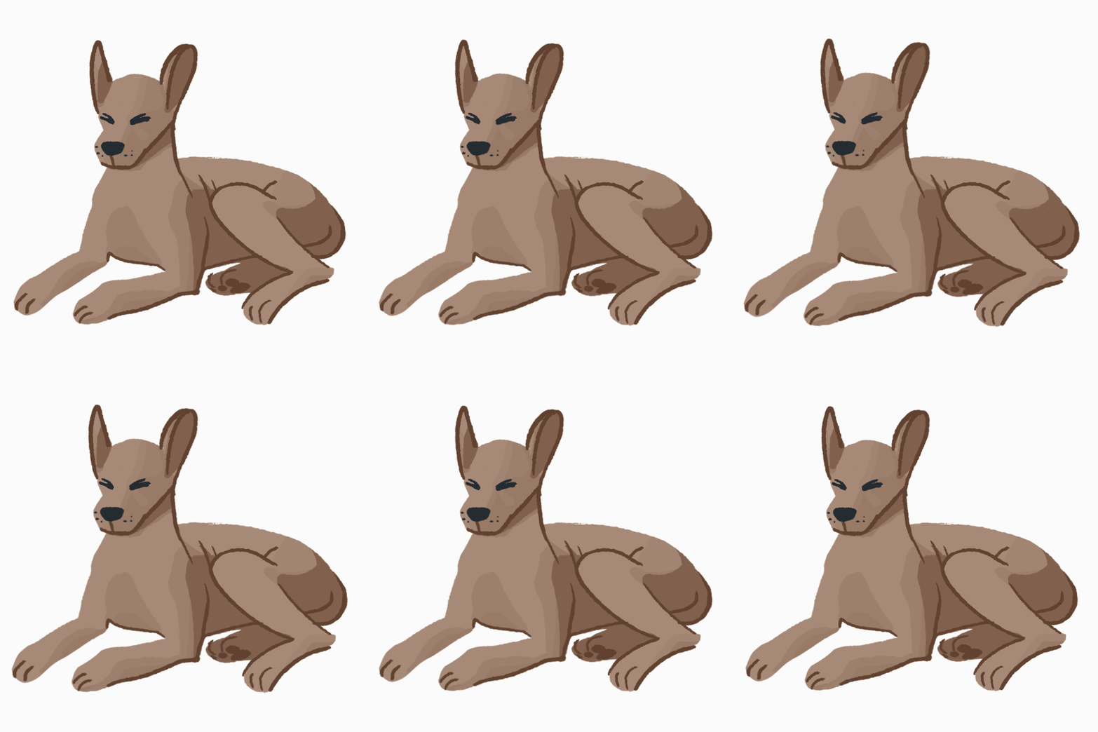
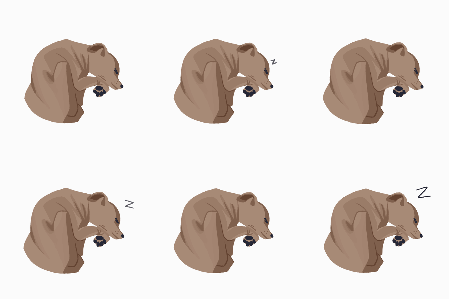
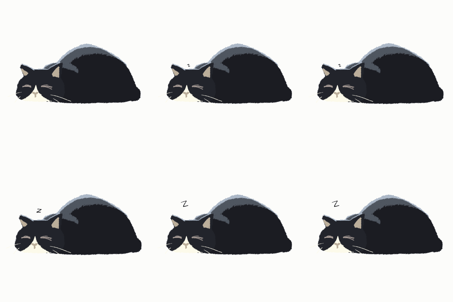
In our team project, I primarily worked as the character artist and animator, focusing on concept and sprite development for each of the spirit guides, the axolotl and the hummingbird, as well as implementing background character assets such as the sleeping cat and the swarm of butterflies. Each character asset was then animated using a mixture of key poses and keyframe animation with the art program, Clip Studio Paint. Along with animating the character assets, I was tasked with animating the opening and closing sequences for the game. Both sequences were a compilation of multiple clips I individually created that I then merged together to create one unified piece. Furthermore, I also contributed to the color design for the backgrounds, working collaboratively with my co-artist on some parts of the maps such as the market stalls, the foreground elements, and the colorful tone we wished to exemplify.
Artistic Statement
For this project, my artistic intention was to explore the beauty of memories, creating an immersive experience that would feel both vivid and whimsical. I wanted to play around with some of the beautiful aspects of Dia de Los Muertos by implementing elements such as marigolds, butterflies, axolotls, skull mask patterns, and papel picado. I used a moodboard created by Sam Trejo that pioneered a lot of the visual design. The moodboard contained a vast collection of beautiful art and designs in Mexican culture and the symbolic animals and items associated with it. In terms of the art style, I was influenced by Disney concept art– in particular, I was inspired by Wish. While I’m not exactly a fan of the actual movie, I was especially interested in the prototype concept designs that were made. The style was very emotionally moving and perfectly matched the sort of vibe I was seeking. Furthermore, I was inspired by storybook techniques that I felt created a sense of nostalgia that would play well into the game. To achieve these goals, I utilized digital painting tools such as texture brushes, lighting effects, colorful gradients, and many more. I chose a vibrant color palette that included colors such as magenta, orange, and cyan (colors I associated with Dia de Los Muertos). This combination of colors and techniques allowed me to express the sense of beauty and vibrancy that I aimed to convey in the final product.
Mors
Description of Work
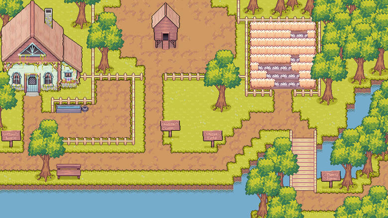
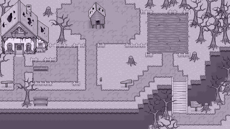
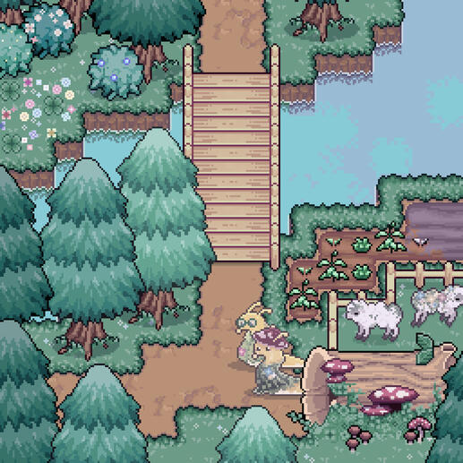
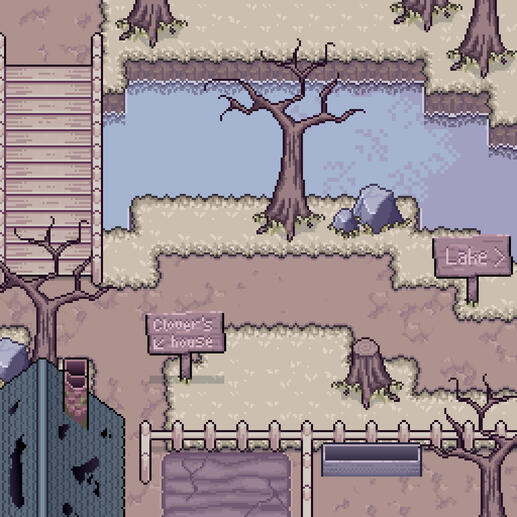
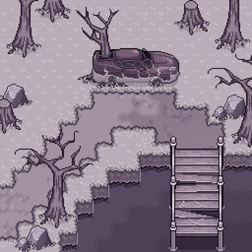
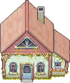
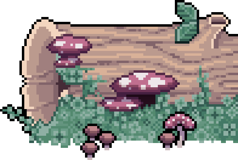
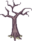
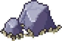
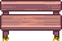
For this team project, I took on the role of environmental art, designing and creating the background assets and mapping out each stage of our game. My contributions included a wide range of environmental assets such as trees, foliage, buildings, grass and dirt tiles, fences, bridges, and more—elements that shaped every stage like clay mold and Playdoh. To streamline my workflow, I used tilesets to my advantage, allowing me to work more efficiently while maintaining visual consistency. The bulk of my work was created using the pixel art program, Aseprite.
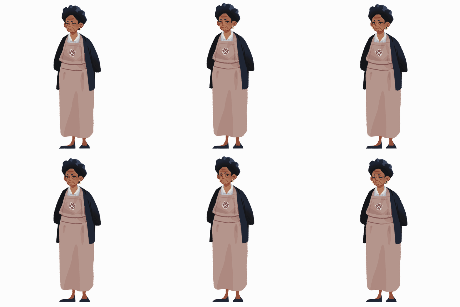
Furthermore, I served as an art consultant, guiding the sprite development and the overall game interface. Using Clip Studio Paint, I helped adjust the lighting and shading in the title screen in order to establish the appropriate mood and tone, making sure it aligned with the ambience of the sky and the game’s maturity. I was also involved in character design decisions, from refining the correct pose and shading of our protagonist, Willow, to details like making Puddle the slug’s glasses bulkier. Additionally, I recolored stage 2 sprites to keep it in line with the environment’s tone and contributed to the design decisions for various UI elements, including the buttons, the loading screen, and the layout of the controls panel. Throughout the project, my primary focus was on designing a unique environment that matched the narrative while maintaining the cute aspects of traditional top-down pixel games.
Artistic Statement
As a newbie to environment art and the style of top-down pixel games, many of my design choices were guided by the limitations of pixel art and its cutesy nature. One of my goals this time around was to capture the nostalgia of classics like Pokémon, The Legend of Zelda, Stardew Valley, Fields of Mistria, and Plants vs. Zombies. These games stood out to me for their vibrant environments with each asset conveyed clearly despite the constraints. The color palettes also seemed to draw attention to the scenery without overshadowing the spritework which was something I wished to exemplify.
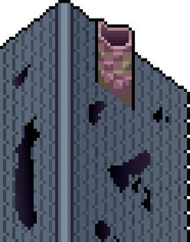
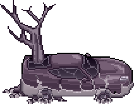
For the color and tone, I drew some inspiration from Hollow Knight, Little Nightmares, and Night in the Woods. I was particularly drawn to the challenge of turning something that was visually vibrant and colorful into something more somber and melancholic. In order to achieve this, I heavily used monochromatic color schemes for the latter half of the game, though avoiding pure white, black, or gray to maintain a subtle vibrancy while conveying an eerie and desaturated atmosphere. Throughout the stages, I gradually reduced color saturation by using blending modes such as color and soft light layers until the last stage became completely monochrome with a slight purplish tint. I further emphasized this shift by portraying the progressive breakdown of the assets from the bridges, buildings, and trees.
